For graduate students, postdocs, and scientists writing their first paper
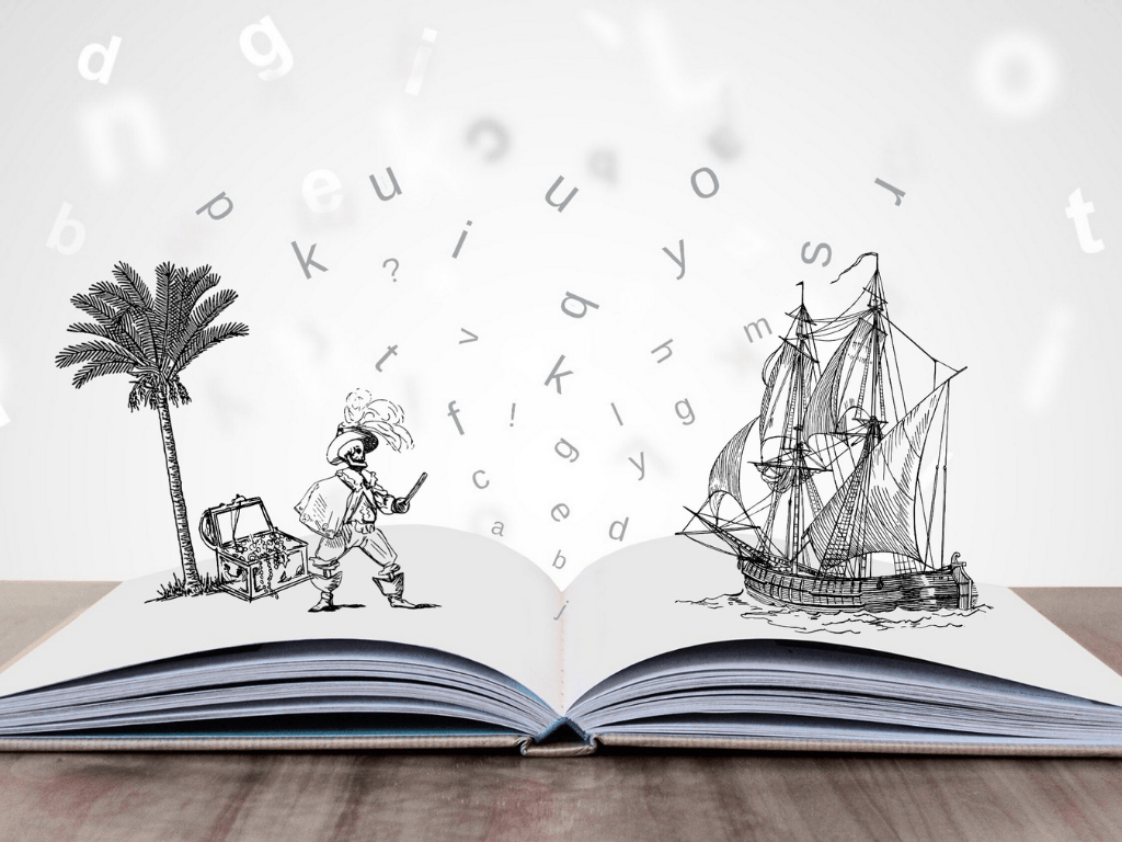
Drowning in data?
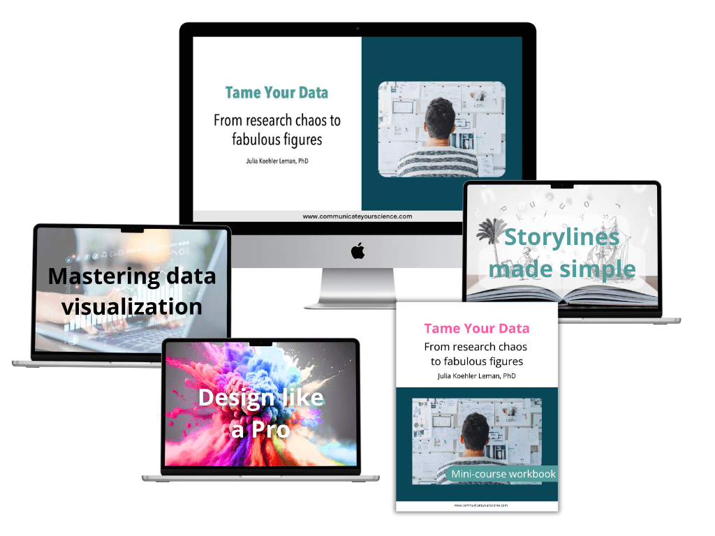
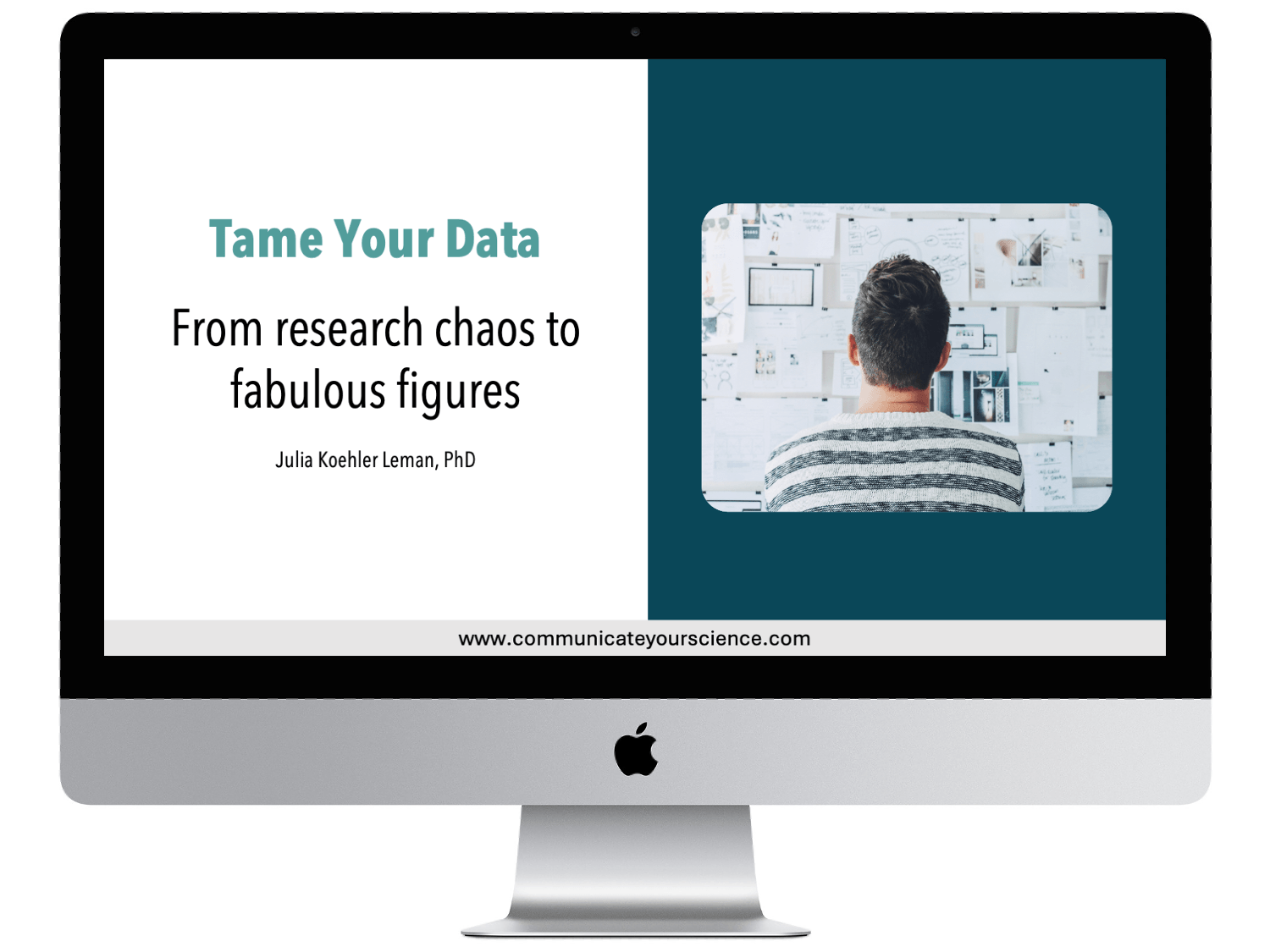
Turn your research chaos into clear figures in 6 simple steps using the Tame-Your-Data Mini-course
Turn your data into a clear, compelling storyline for your paper
Know when to stop collecting data and move forward with confidence
Make your data analysis clear and accurate for faster paper acceptance
Use simple design tips to create standout, publication-quality figures
Follow an easy, step-by-step system to streamline the entire process
Finalize data collection, organize your data with ease,
and create publication-quality figures that impress reviewers.
Does this sound familiar?
You're a dedicated scientist with lots of data in hand, but something isn't clicking. The path from your raw data to publication feels more like a maze than a clear road ahead.
You might be feeling:
Data overwhelm: You've collected mountains of data, but organizing it into a coherent story feels impossible
Analysis paralysis: You're caught in the cycle of "just one more experiment," unsure when you have enough to move forward
Frustration with figures: Despite hours of tweaking, your figures still don't match the quality you see in published papers

And the most challenging part? You're often expected to figure this all out on your own. Your PI assumes you'll master data organization and visualization through trial and error, but you know there must be a better way.
What you really need is a clear system to transform your research into publication-ready figures – one that helps you organize your data, craft compelling storylines, and create publication-quality figures that truly showcase your work.
Imagine if ...
You walk into your lab tomorrow with a clear roadmap in hand. Instead of drowning in data, you have a proven step-by-step process that transforms your research into publication-ready figures and a story worth telling. No more guesswork, no more uncertainty.
Here's what becomes possible:
You'll move through your research with newfound confidence, knowing exactly when you have enough data and when it's time to stop collecting more
Your figures will transform from basic plots into polished, professional figures – without the endless hours of tweaking and second-guessing
Most importantly, you'll master the skill that changes everything: turning raw data into a compelling scientific story. The most time-consuming part of paper writing turns into a confident win.
Think about it: instead of staring at spreadsheets wondering where to start, you'll have a repeatable system that guides you from research chaos to fabulous figures. Your research deserves to be seen, understood, and published – and now you'll know exactly how to make that happen.
Introducing the Tame Your Data Mini-course
A proven system that helps graduate students and postdocs lay the foundation for a strong, well-organized paper in weeks instead of months.
All for less than the cost of a textbook!

Julia Koehler Leman, PhD
Scientist, software engineer
and course creator
My first paper took 18 iterations of writing over 18 months and it was a grueling process. My second paper took 2 weeks, a few small edits and I received the Best Paper Award at a conference! Over the next 15 years, I’ve refined the strategy that I learned that now allows me to publish effortlessly in high-impact journals. And I taught many of my over 30 mentees over the years to do the same.
So what's the Mini-course about?
The Mini-course tackles the first major hurdle that scientists struggle with before they even get to write their paper: organizing their data.
But what you’ll get is a whole lot more than that.
You’ll learn how to organize your data, create clear storylines, and design polished figures—without wasting endless hours tweaking and second-guessing.
I’ll teach you my step-by-step system, backed by years of experience helping scientists like you turn messy research into published papers.
This process will transform how you approach your research and make the entire workflow—from data organization to figure creation—a whole lot easier (and maybe even fun).
You’ll finally have fun organizing your data
You’ll feel confident creating figures that look amazing and tell a clear story
You’ll spend less time stuck in data chaos and publish your paper faster
Quite possibly, you might even enjoy analyzing your data
THIS is what I’m talking about.
Because at the end of the day, you’re a scientist.
And while data analysis and figure creation are at the heart of being a scientist—they shouldn’t feel like an overwhelming question mark.
Mastering these skills will make you a better, more confident scientist.
It’s not just about showing your data—it’s about telling a story that people can quickly and easily understand—all while making the process more enjoyable for you.
Want me to show you how?
Trusted by experts at


Trusted by experts at
What's in the Mini-course?
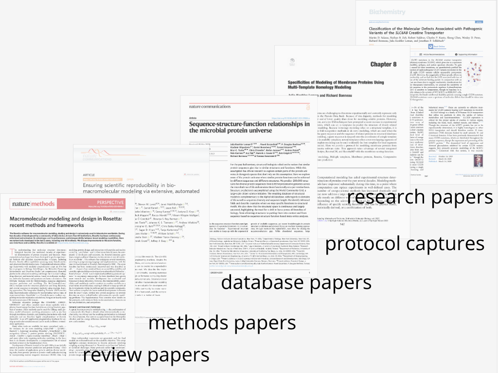
1. Find the perfect fit:
Understanding different types of papers
Learn how understanding different types of papers helps you find the perfect paper fit for your research
Identify the best storyline approach for your paper based on its type
2. Craft your paper’s core:
Storylines made simple
Access ready-made templates tailored to different types of papers to speed up your process
Get inspired by 17 real paper examples that demonstrate how to craft a compelling storyline

3. From chaos to clarity:
Turning your data into a storyline and figures
Follow a step-by-step process to turn your raw data into a cohesive storyline that flows logically
Learn how to decide which data to include, what to discard, and what might still be missing
Know when it’s time to stop collecting more data and start writing with confidence

4. Showcase your results:
Mastering data visualization
Learn how to present your data in a way that clearly communicates your key message
Avoid common data visualization mistakes that can confuse reviewers or derail your paper

5. Design like a pro:
Secrets to polished, professional figures
Discover 11 simple design secrets that instantly make your figures look polished and professional
Understand key considerations, like color choices and layout, that elevate your figures
6. Get it submission-ready:
Creating publication-quality figures
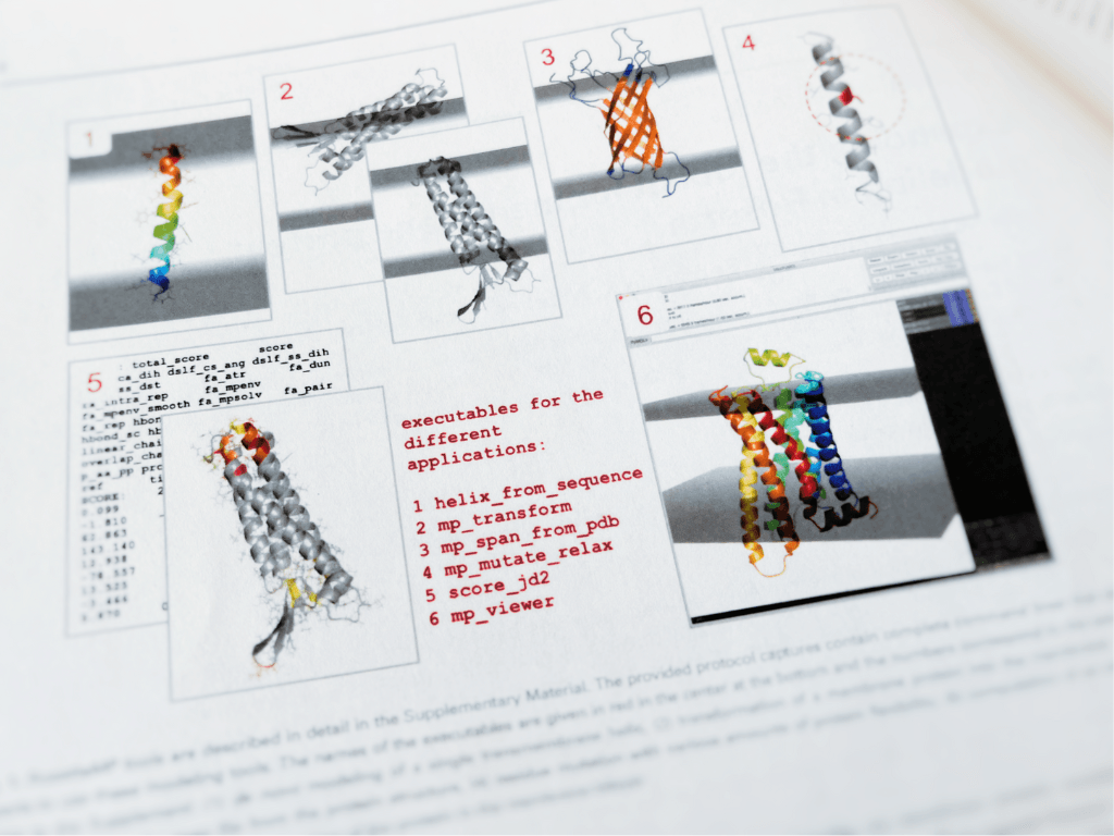
See how figures evolve from rough drafts to polished, publication-quality images with real examples
Learn how to adhere to specific journal requirements, so your figures are never a roadblock to acceptance
Use the included checklist to declutter your figures and create a clean, professional look that instantly enhances your paper
Hey there, I'm Julia
I’m a scientist, software engineer, and biomolecular modeler.
I help undergraduates, graduate students and postdocs to communicate their science better.
My career spans various disciplines from Physics (that’s what I got my Masters degree in), to Chemical and Physical Biology (that’s what I received my PhD in), to having spent time in departments such as Chemistry, Chemical and Biomolecular Engineering, and Biology, while doing software engineering.


What I’ve learned during my 15+ years as a scientist is the importance of communicating your science to a diverse audience. My experience in interdisciplinary research, software engineering, reading and reviewing scientific papers and teaching trainees how to write well, made me passionate about teaching this skill to you.
I created this course because I kept repeating myself over and over again to different people and I wished I would have had a resource like this when I wrote my first paper. Yes, it’s a skill that can be learned. And no, it’s not taught well or often in college or university. You know that academic writing, and specifically writing and publishing journal articles, is the currency of any academic career. If you learn this skill alone, it can transform your entire career.
Are you ready for me to show you how?
17+ years experience in scientific writing
15+ years experience in mentoring
30+ trainees helped from high-school students to research scientist
30+ publications, including in Nature Methods and Nature Communications
17+ years experience in scientific writing
15+ years experience in mentoring
30+ trainees helped from high-school students to research scientist
Is this program right for you?
This program IS for you if:
You want to learn a proven system to organize your data, craft a clear storyline, and create publication-quality figures
You’re a motivated researcher ready to invest focused time and effort to streamline your research process
You’re open to shifting how you approach data analysis and figure creation to work smarter, not harder
You’re ready to take action and turn your pile of data into a great foundation for your paper
This program is NOT for you if:
You’re not ready to dedicate consistent time to understanding your data in detail, possibly repeat some experiments and take time to shape your storyline. Progress requires focused effort every week.
You’re looking for a quick fix or an effortless shortcut—this program delivers results, but only if you’re committed to putting in the work.
You think you can get it right in one go. The truth is, creating a great storyline and figures takes iterations, feedback, and refinement.
You expect that once your data and figures are done, writing the paper will take care of itself. Crafting a high-quality manuscript is a separate process—and we have a whole course dedicated to that.
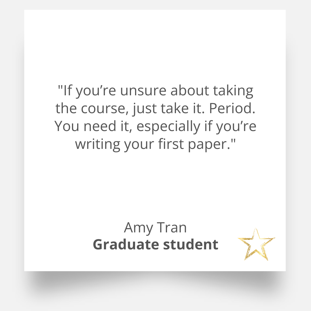
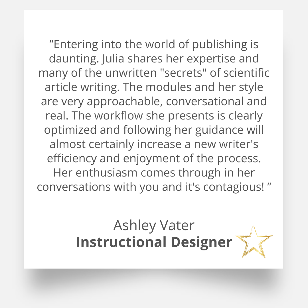
What students and faculty say
Mini-course features
A user-friendly, step-by-step mini-course designed to help you organize your data, create a storyline for your paper and create publication-ready figures without feeling overwhelmed
The Mini-course covers 6 videos in over 90 mins of content
Lifetime access to the self-paced video mini-course with future updates included
Downloadable workbook with actionable steps to accompany the program
Weekly email check-ins to keep you on track
17 real paper examples demonstrating different types of storylines and figure designs
Complete system with templates, checklists, and workflows for organizing data, creating storylines, and designing figures
Get all this for only: $35
Our 24-Hour No-Risk Guarantee

If you don’t like Tame Your Data within 24 hours—whether it’s the teaching style, format, or content—email me, and I’ll issue a full refund. No hassle. However, this guarantee is for students who genuinely feel the course isn’t a good fit, not for those looking for free access. I trust you to be fair, and I’ll honor your request—just let me know in two sentences what you've tried and why the course didn’t meet your expectations. Your feedback helps me improve!
Not sure yet?
There are no formal prerequisites. However, this Mini-course is ideal for students who have a basic understanding of scientific research and are actively involved in or planning to start data analysis, figure creation, and structuring their results for publication.
The best time to take this course is at the middle or end stages of your research project, as you start organizing your data for publication. This timing allows you to implement the strategies for creating a clear storyline and learn how to make publication-quality figures while ensuring your data and results are presented effectively.
The Mini-course material itself takes about 90 minutes to review, but the time required to apply the techniques will vary depending on your specific research project. Some participants may need to repeat experiments or conduct new ones to address gaps in their data, while others can immediately focus on organizing and visualizing existing data. The course is self-paced, allowing you to progress at a speed that aligns with your project’s needs and timeline.
Yes! Even experienced researchers often struggle with organizing data efficiently. This course helps streamline your process, saving you months of frustration.
This Mini-course is designed to cater to researchers at various career stages, from graduate students to seasoned scientists. The content focuses on helping you improve the clarity, impact, and presentation of your data, ensuring it is ready for publication or presentation. Your success depends on your commitment to applying the techniques to your work, and the strategies provided are actionable and broadly applicable.
We offer a 24-hour no-risk guarantee. If you are not satisfied with the course content or do not find it beneficial within the first 24 hours, you can request a full refund. Just let me know in two sentences what you've tried and why the course didn’t meet your expectations. We aim for your satisfaction and want to ensure that the course meets your expectations.
You will have lifetime access to the course materials. This means you can revisit the content as often as needed, at any time, to refresh your knowledge or check for updates to the curriculum.
While no course can guarantee publication, this course equips you with tools to ensure your data is effectively analyzed, visualized, and presented in a way that meets journal standards. Clear and compelling figures and well-structured results sections are key to successful publication, and this course focuses on enhancing those aspects. Moreover, my personal journal rejection rate is exceptionally low, around 3%, which reflects the effectiveness of the strategies you will learn.
Absolutely. While the primary focus is on creating figures for manuscripts, the techniques and principles you will learn are broadly applicable to scientific posters, presentations, and other forms where you communicate your scientific data.
The assignments are designed to help you work on your own data, although examples are provided for guidance. This hands-on approach ensures that what you learn can be immediately applied to your work, allowing you to make progress on your actual project and manuscript.
Absolutely. Even experienced researchers will benefit from the techniques and insights shared in this course. From refining figure layouts to aligning your data presentation with journal requirements, this Mini-course provides tools to enhance the quality and impact of your figures, regardless of your level of experience.